
JOURNAL
GOOD IDEAS.
NO GATEKEEPING
Building a drinks brand? Pull up a chair.
From the first flavour idea to the final can on the shelf, we’re sharing what we’ve learned about creating, launching and growing drinks brands.
Real advice, useful insights and a little help from people who know their stuff. On the house.
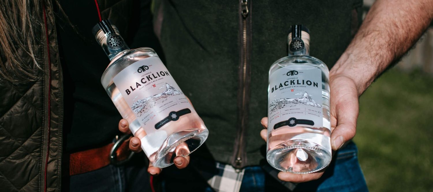
HOW WE DESIGN DRINKS PACKAGING THAT STANDS OUT ON THE SHELF
Let’s be honest. The drinks aisle is a pretty crowded place.
Craft beers, functional sodas, ready-to-drink cocktails, alcohol-free alternatives. Everyone’s fighting for a little attention.
And while the liquid inside might be brilliant, nobody’s going to discover that if the packaging doesn’t make them want to pick it up. At RTD, we believe great drinks packaging should do more than look good. It should tell a story, create a connection and give people a reason to choose your drink over the one sitting next to it. So, how do we make that happen?
01. KNOW WHAT YOU’RE SELLING. AND WHO YOU’RE SELLING IT TO.
It’s tempting to jump straight into colours, logos and packaging mock-ups. We get it. That’s the fun bit. But before we start designing anything, we need to understand what we’re actually creating. Who is this drink for? Why does it exist? What makes it different? And, perhaps most importantly, why should anyone care?
A premium alcohol-free aperitif has a very different job to an energy drink aimed at festival-goers. The audience, occasion and personality should all influence the design. We start by understanding the brand, the people buying it and the competition it’s up against. Because a great-looking can is one thing. A great-looking can with a reason to exist? Much more interesting.
A little tip: Before briefing a designer, try explaining your brand in three sentences. Who it’s for, what makes it different and how you want people to feel about it. If you’re struggling, your brand strategy might need a little more attention first.
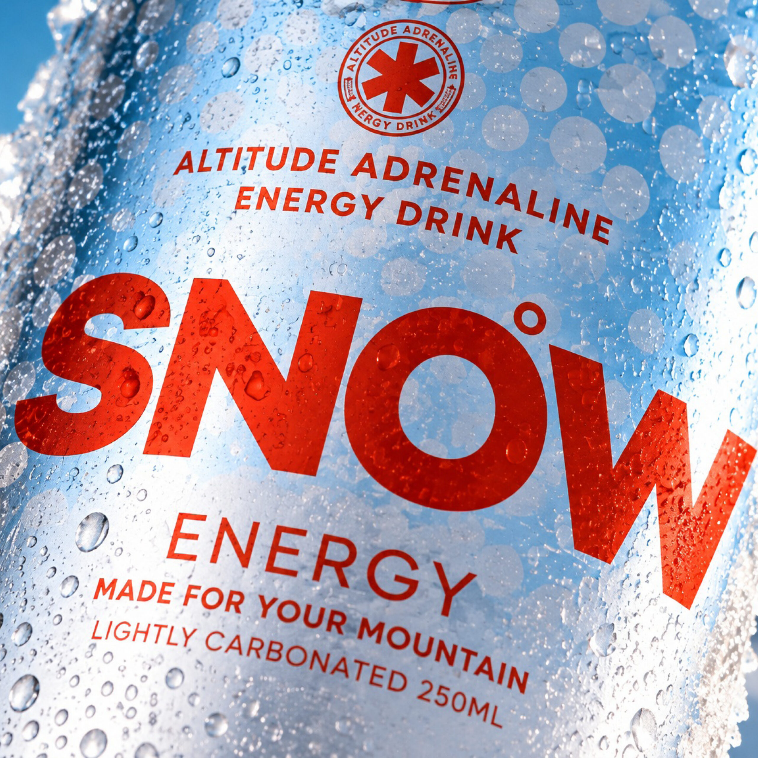
02. STAND OUT. DON’T JUST SHOUT LOUDER.
The drinks aisle is a noisy place. Bright colours, big typography, bold claims. Everyone’s fighting for attention.
But standing out doesn’t always mean being the loudest. Sometimes the smartest thing you can do is go in the opposite direction. If everyone else is using fluorescent colours, perhaps restraint is your superpower.
Before we start designing, we look at what’s already on the shelf. What’s working? What’s overdone? And where’s the opportunity to do something genuinely different?
We’re looking for those distinctive little details that make a brand recognisable. A colour combination, a typographic style, an illustration or even the way information is arranged. Because the best drinks brands don’t need to shout their name every time you see them. You just know.
Try this: Put your packaging next to five competitors and cover the logos. Can you still pick yours out? If not, there’s probably more work to do.
03. THINK BEYOND YOUR FIRST CAN.
One flavour might look fantastic on its own. But what happens when there are four? Or six? Or twelve? Trust us. There’s always another flavour idea.
Drinks brands evolve, and packaging needs to grow with them. That’s why we think about the wider product range from the beginning. Colour is a brilliant way to distinguish flavours, but it shouldn’t be doing all the work. Typography, naming and visual structure all help create a family of products that feels cohesive without becoming repetitive.And it’s not just about different flavours.Your packaging might need to work across single cans, multipacks, retail displays and an ever-growing collection of marketing materials.
The goal is to build a design system that can adapt without losing its personality. Our advice: Even if you’re launching with one flavour, mock up another three. It’s a simple way to see whether your packaging has enough flexibility to grow.
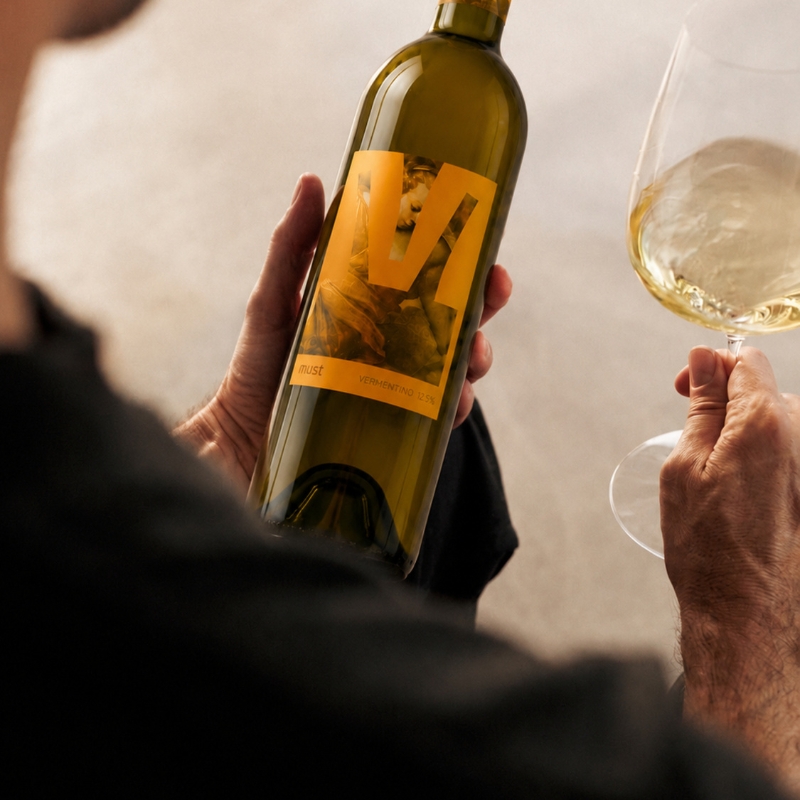
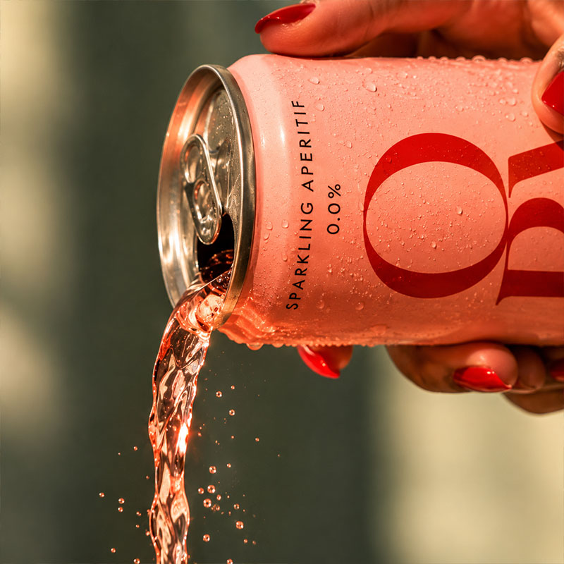
04. BEAUTIFUL DESIGN. MEET THE REAL WORLD.
A can might look incredible in a beautifully lit mock-up. But what happens when it’s printed? Filled? Packed into trays? Stacked on a shelf? These are the less glamorous questions. They’re also pretty important.
We know just how closely packaging design and production need to work together. Different print methods, materials, finishes and minimum order quantities can all influence your creative decisions. And the last thing you want is to fall in love with a design that turns out to be difficult or unnecessarily expensive to produce. It’s also worth remembering that your packaging has a life beyond the supermarket shelf. It needs to look good in someone’s hand, on a restaurant table, in a social media post and as a tiny thumbnail on a retailer’s website. Good packaging doesn’t just photograph beautifully. It works beautifully. One last tip: Speak to your packaging supplier early. Get the artwork specifications, understand the production limitations and ask for physical samples before signing anything off. Future you will be grateful.
SO, WHAT’S THE SECRET?
There’s no magic colour. No perfect typeface. No secret formula that guarantees your can will be the one everyone reaches for. Sorry about that.
But great drinks packaging does have a few things in common. It knows its audience, has something distinctive to say and works just as hard in the real world as it does on a designer’s screen. And if there’s one thing I’ve learned from working on drinks brands, it’s this:
Don’t just design a can that looks good. Build a brand people want to pick up.
Hopefully that’s given you a few things to think about before your next packaging brief.
See you on the shelf.
Megan
WORK TOGETHER
LET’S TALK DRINKS.
Whether you’re launching something new or looking to take your brand further, we’d love to hear from you.